Form element reference
Element-specific options are noted below. See Form element settings reference for documentation on options that are common to many form elements.
Checkbox Input
A single checkbox.

Confirm Password Input
A password input and a confirmation input. Their values must match before the form can be submitted.

Date & Time
A date and time selector. The date is in day, month, year format. The output is always UTC.

Dropdown
A dropdown list.

Dual List
A two-column control. Allows users to move items from one list to another. The right side is treated as the output.
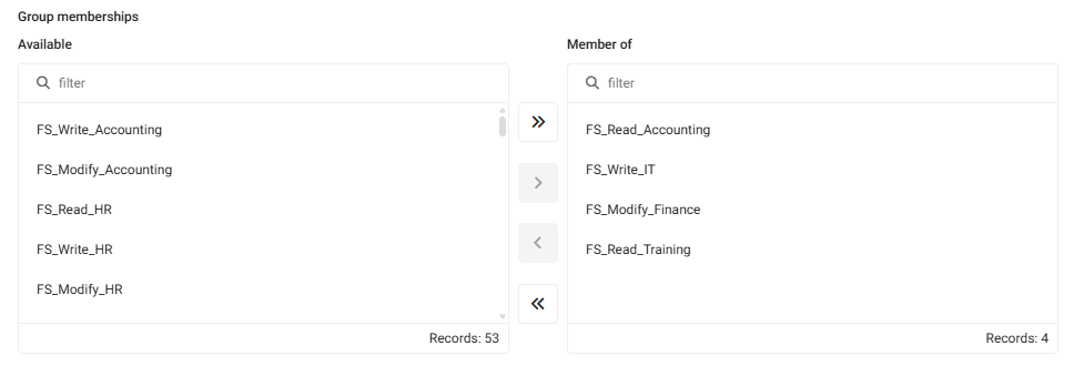
Both sides show the total number of items on that side. These numbers update automatically as items are selected and moved.
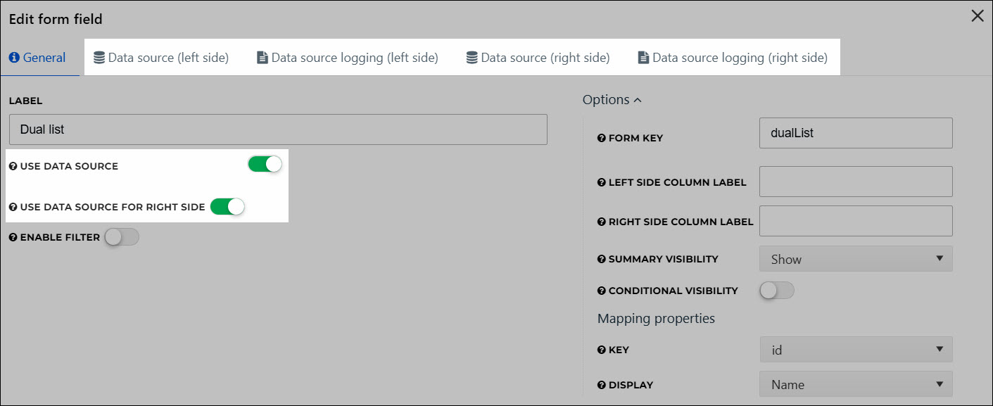
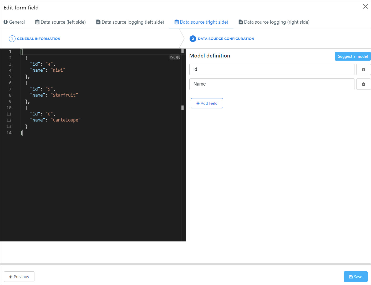
A dual list can take zero, one, or two data sources. If you use data sources, they populate the initial values of the left and/or right side of the list, respectively. For example:


Important
If you use data sources for both the left and right sides, the left side must contain all of the left side values and all of the right side values. The right side must contain the right side values only. This is depicted in the above example.
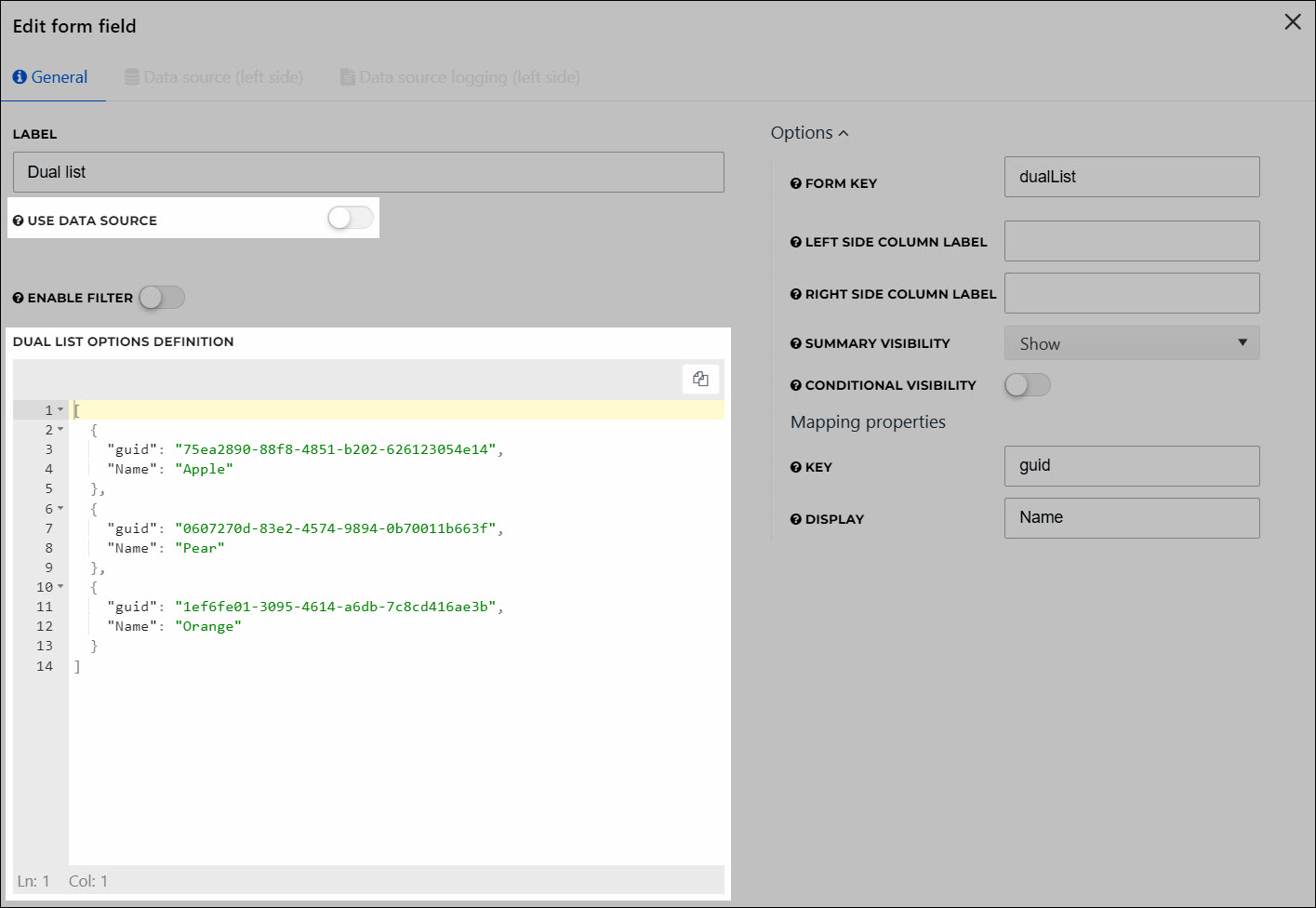
The alternative to using data sources is to provide a static JSON array, which populates the left side only. For example:

Email Input
An email address input.

Form Row
A container which holds up to three other form elements. It displays these elements horizontally, on the same row.
When you create a Form Row element, it contains two Checkbox Input elements as placeholders:

You can delete them as needed, and/or drag-and-drop other form elements into the Form Row. For example, in the following screenshot, the second Checkbox Input has been deleted, and a Dropdown has been added in its place:

By previewing the form, we see the elements are horizontally aligned on the same row:

Grid
A grid with selectable rows based on data from a data source.
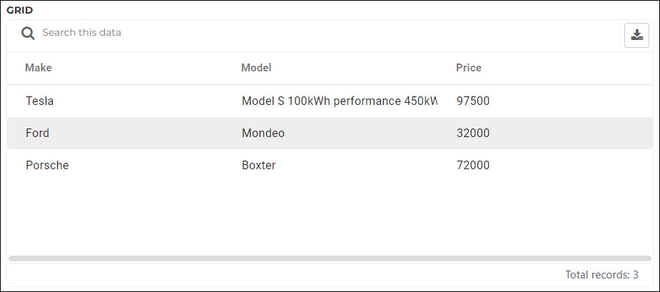
When a grid element is used in production, users can click  Export to download a .csv file with the grid's current results. The availability of the download CSV button depends on the grid configuration. Only currently displayed fields (limited by the current search term, etc.) are included.
Header
An <h3> tag with static text.

Markdown
A paragraph of markdown text, where you can add various types of formatting and external links. Advanced font styling (e.g., color) and embedded images are not supported. See Markdown syntax.

Multi Checkbox
A group of check boxes. Allows end users to select zero or more options from the group.
If the Multi Checkbox element is set to Required, users must select at least one option from the group.

Multiselect
A multiselect element, where users can select any number of given values.

Multiselect Grid
A grid with selectable rows based on data from a data source. Users can select any number of rows.
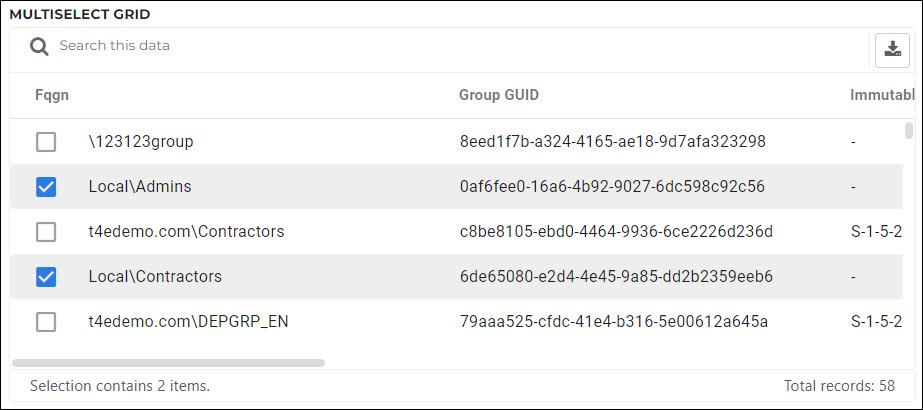
When a grid element is used in production, users can click  Export to download a .csv file with the grid's current results. The availability of the download CSV button depends on the grid configuration. Only currently displayed fields (limited by the current search term, etc.) are included.
Number Input
A numeric input.

Password Input
A single password input. No confirmation is necessary.

Radio
A set of radio buttons.

Text
A paragraph of static text.

Text Area
A multiline text area.

Text Banner
A color-coded text banner. Particularly useful in combination with the Conditional Visibility option, to call attention to invalid or missing input values on other form elements, etc. Supports Markdown syntax.
There are 3 different Banner Types available. There is no difference in functionality, only in the display color.
Info

Warning

Danger

Text Input
A single line text input.

Time
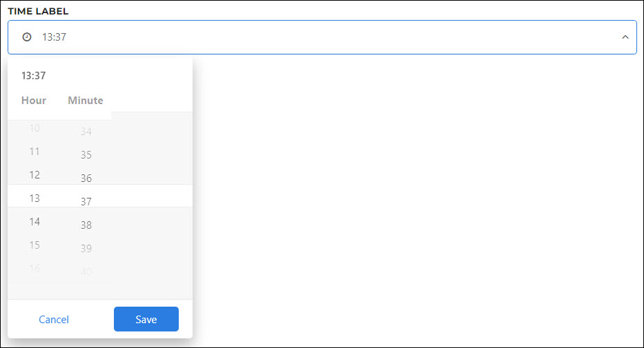
A time selector.
User Selector
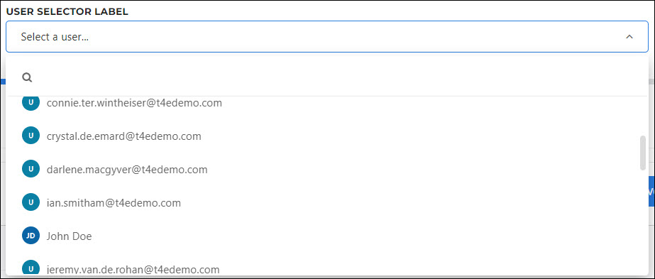
A user selection dropdown, where the end user can select another HelloID user in your organization. This can be used to perform actions on the selected user, or pass along that user's information as part of the form submission.
The Scope field in this element's configuration is a user scope filter which determines the users that will be available for the end user to select. See User scope filters.
